Blog
How to Enhance Document Accessibility in Word

Ensuring document accessibility in Microsoft Word is essential for making content readable and usable for everyone, including individuals with disabilities. By following accessibility best practices, you can improve the clarity, navigation, and compatibility of your documents with assistive technologies like screen readers.
This guide will walk you through key steps to enhance accessibility, including using headings, adding alt text to images, setting proper contrast, and utilizing Word’s built-in Accessibility Checker. These techniques not only help users with disabilities but also improve overall document structure and readability.
Table of Contents
- Add Alternative (Alt) Text to Visuals
- Include Closed Captions in Videos
- Use Descriptive Hyperlink Text
- Use Accessible Text Formats and Colors
- Build a Logical Document Structure
- Use Table Headers and Simple Layouts
- Review Your Document with the Accessibility Checker
Add Alternative (Alt) Text to Visuals
Screen readers, as the name suggests, read text aloud from the screen. However, while they are advanced, screen readers cannot interpret the context of images or graphics without the aid of alt text. By adding alt text to visuals in Word, you enable screen readers to provide a spoken description, helping those with visual impairments understand the content.
It’s important to know when to include alt text for objects in your document. For decorative graphics, such as page borders, alt text is not necessary. Instead, you can mark the graphic as decorative in Word, which informs screen readers that the image is purely aesthetic. Similarly, tables do not require alt text, as screen readers can already interpret the content within them.
Alt text should be added to any visual that provides additional context to your document. This typically includes:
- Images
- Photographs
- Pictures
- Diagrams
- Charts
- Icons
- Shapes
Writing effective alt text takes practice, but it’s essential to provide a clear and concise description of the visual. Aim to describe the visual in one or two sentences, though sometimes a few well-chosen words will suffice.
Here are some key tips for writing good alt text:
- Avoid phrases like “an image of” or “a graphic showing.”
- Do not use surrounding text as alt text.
- Write the alt text as you would any other descriptive sentence.
- For flow charts, describe the entire process from start to finish, even if it’s lengthier than other graphics.
While Microsoft provides an option to automatically add alt text to images, it’s not always reliable. Just as you wouldn’t let someone else write your content, you should ensure the alt text is accurate.
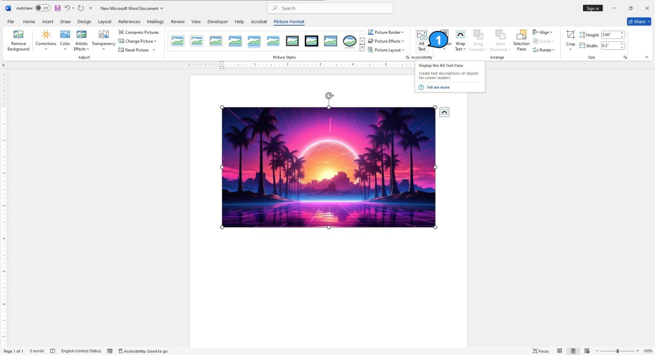
To add alt text in Word, select the image, then click the “Alt Text” option in the “Accessibility” group under the “Picture Format” tab.

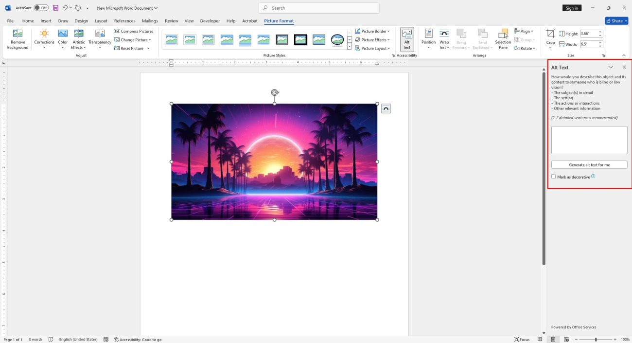
The “Alt Text” pane will appear on the right side of your Word document. Here, you can write your own alt text, let Word generate a description for you, or mark the graphic as decorative.

Include Closed Captions in Videos
Videos can enhance your Word document, but it’s important to ensure they are accessible to everyone. Adding closed captions allows individuals with hearing impairments or those who prefer to read on-screen text to fully engage with the video content.
Unfortunately, Microsoft Word doesn’t have a built-in feature for adding closed captions. If you created the video yourself, you can manually create captions using a text editor (e.g., Notepad) and save the file with a .vtt extension.
If you’re linking to or embedding a YouTube video, it will likely have closed captions, thanks to Google’s Speech Recognition, though these captions may not always be accurate. It’s a good idea to review the video with captions enabled to ensure they are correct. If they’re inaccurate, consider linking to a different video.
Use Meaningful Hyperlink Text
Screen readers allow users to skip through links, so it’s essential that hyperlinked text is clear and descriptive. Phrases like “click here” or “see more” are ambiguous and don’t provide context. Ideally, use the title or description of the linked content so users understand the purpose of the link before activating it.
When linking to an image, ensure that the image’s alt text describes the link’s purpose and destination, not the image itself. Although it’s best to avoid linking images, if necessary, be sure the alt text clearly indicates the link’s function.
Use Accessible Text Formats and Colors
When adding hyperlinks, Microsoft Word underlines them by default. It’s advisable to keep this underline to help users easily identify links, especially for those with visual impairments.
For better accessibility, use indicators other than color to convey meaning. For example, using checkmarks and X’s instead of green and red makes it easier for colorblind individuals to distinguish correct or incorrect items.
Also, ensure there is sufficient contrast between the text and background to enhance readability. Light text on a light background, such as light gray on white, can make the text hard to read.
Build a Logical Document Structure
A logical document structure is essential for both readability and accessibility. Proper use of headings plays a critical role in this. A common mistake is resizing text and making it bold to create section titles. While this may seem effective, it can confuse screen readers, making it difficult for them to navigate the content. It also results in a poorly structured document.
Microsoft Word offers a range of heading styles in the “Styles” group of the “Home” tab. If none of the default styles fit your document, you can modify them to suit your needs.
However, using headings alone isn’t enough—you must apply them in a logical order. For example:
- Heading 1
- Heading 2
- Heading 3
- Heading 3
- Heading 2
- Heading 3
- Heading 2
This is an example of proper heading hierarchy. In contrast, the following is an incorrect structure:
- Heading 3
- Heading 1
- Heading 3
- Heading 2
- Heading 1
Additionally, use built-in formatting tools for lists or other structures, such as the numbered or bulleted list options in the “Paragraph” group of the “Home” tab. This ensures consistency and accessibility.
Use Table Headers and Simple Structures
When creating tables, simplicity is key. While complex tables can be necessary at times, they can make navigation difficult for screen readers. For example, nesting tables or splitting cells complicates the structure, making it harder for screen readers to track.
Screen readers rely on table headers to understand the content and navigate columns and rows. To ensure accessibility, always add headers to your tables. To do this in Word, click anywhere inside the table, go to the “Table Design” tab, and check the “Header Row” box in the “Table Style Options” group.
Review Your Document with the Accessibility Checker
Microsoft Word’s Accessibility Checker helps identify areas where your document can be improved for accessibility. It checks for issues like missing alt text for images and ensures that tables follow a simple structure.
However, the tool has limitations. It cannot check videos for closed captions, nor can it detect if color is used to convey important information. Therefore, even after running the Accessibility Checker, it’s essential to visually review your document before sharing it.
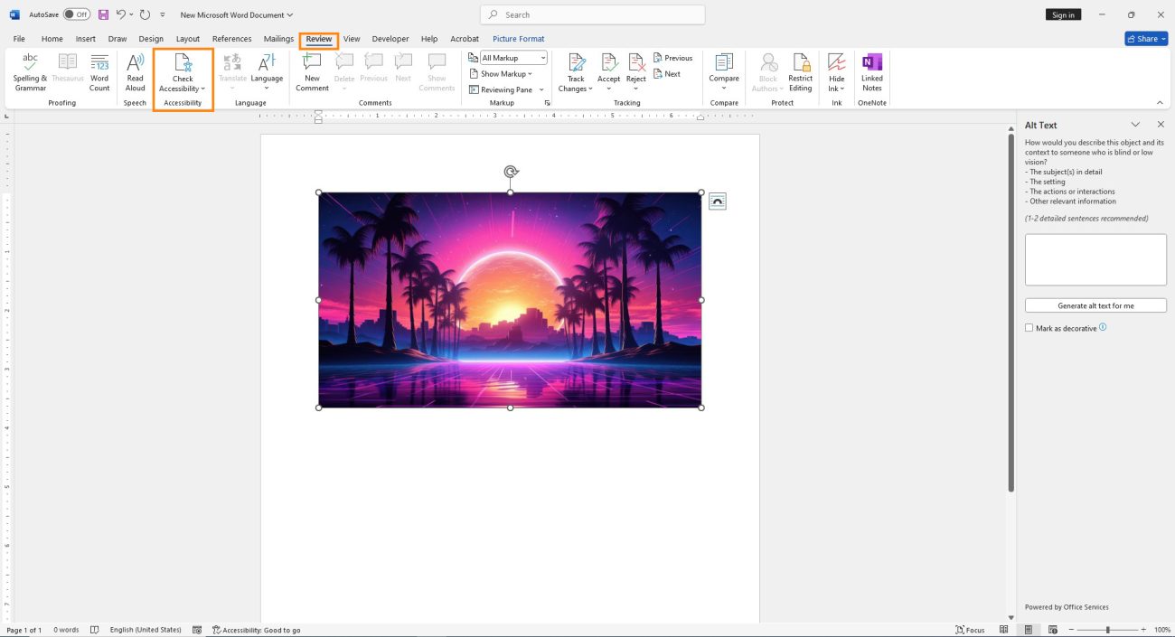
To use the Accessibility Checker, go to the “Review” tab and click the “Check Accessibility” icon in the “Accessibility” group.

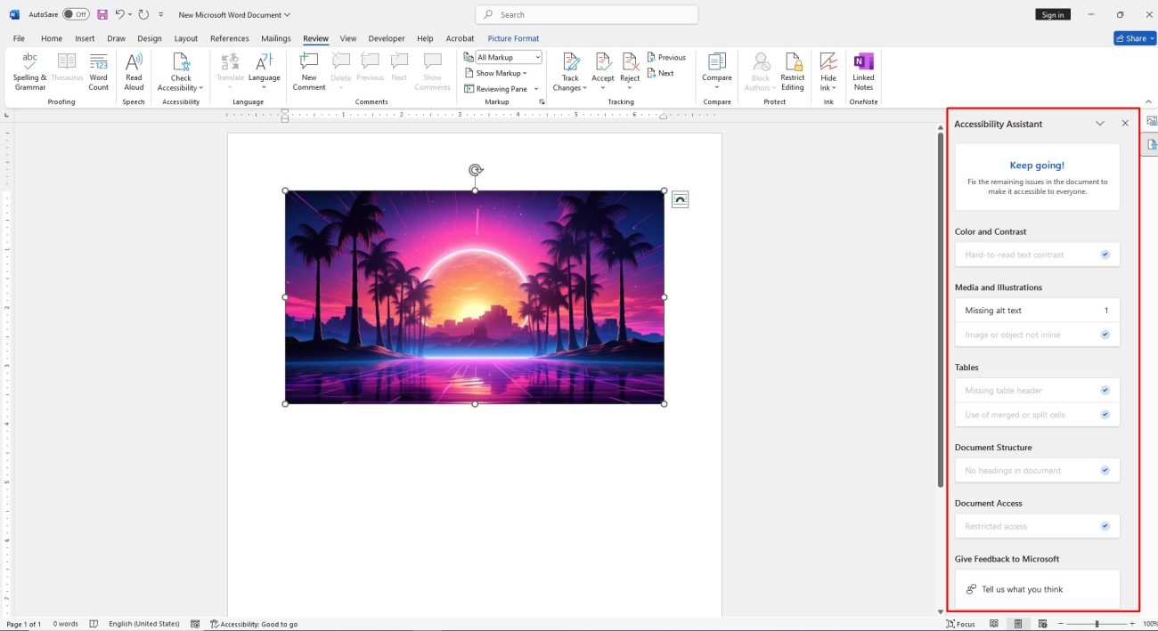
The results of the inspection will appear in the “Accessibility” pane on the right side of the document. Here, you can review any errors and warnings identified by the Accessibility Checker.

After running the Accessibility Checker and ensuring no issues are found, give your document one final visual review before sending it out.
Buy Office at the lowest price, quick delivery, no activation worries!