Blog
How to Insert and Customize Charts in Microsoft Word

Learn to create, insert, and customize charts in Microsoft Word. A quick and easy guide to adding data visuals to your documents.
How to Create a Chart in Microsoft Word: A Step-by-Step Guide
Creating a chart in Microsoft Word can help you present data in a visually appealing and easily understandable way. Whether you need a simple bar chart or a detailed pie chart, Word offers all the necessary tools. Follow this comprehensive guide to learn how to create and customize charts in Word.
Step 1: Insert a Chart into Your Document
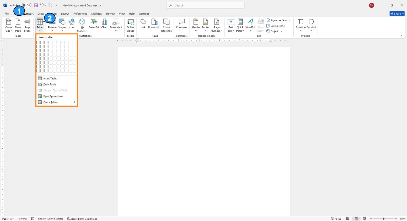
To begin, open your Word document and decide where you want to insert the chart. First, go to the Insert tab in the top toolbar. From there, click on the Chart button, which is located in the Illustrations group. Once you click on it, a new window will pop up with different chart options.
Next, select the type of chart you want to create, such as a Bar Chart, Line Chart, or Pie Chart. After selecting the desired chart type, click OK. Word will then open a new Excel sheet where you can enter your data.
Step 2: Input Data into the Excel Spreadsheet
Once the chart is inserted, an Excel sheet will appear. This is where you’ll input your data for the chart. By default, Word will create a sample chart with placeholder data. You can easily replace this data with your own.
Make sure to organize your data into rows and columns, where each column represents a different series or category. For example, in a bar chart, each column might represent a different month, while the rows represent the sales for those months.
After entering your data, you’ll notice that the chart in your Word document will automatically update to reflect the changes. If needed, you can also adjust the data range by resizing the Excel window.
Step 3: Customize Your Chart
Now that your chart is inserted and populated with data, it’s time to customize it to suit your preferences. You can change the chart’s design, color scheme, and style. To do this, click on the chart to activate the Chart Tools on the ribbon.
Under the Design tab, you can select from a variety of built-in styles and colors. Additionally, you can click on Change Chart Type if you decide that another chart type would better display your data. For example, you can switch from a column chart to a line chart for a different visual representation of your data.
Step 4: Modify Chart Elements
To further refine your chart, you can adjust its individual elements. For instance, you may want to add a Chart Title or Axis Labels for better clarity. To do so, click on the Chart Elements button (the plus sign next to your chart) and select the elements you want to include, such as Data Labels, Legend, or Gridlines.
Furthermore, you can modify the chart’s axis to better represent your data. If necessary, click on the Axis and select Format Axis to adjust settings such as the minimum and maximum values or the axis intervals.
Step 5: Final Adjustments and Review
After customizing your chart, take a moment to review it. Make sure the data is accurate and that the chart is clear and easy to understand. If everything looks good, click anywhere outside the chart to exit editing mode.
Additionally, you can resize the chart by dragging its edges. This will allow you to adjust it to fit properly within your document’s layout.
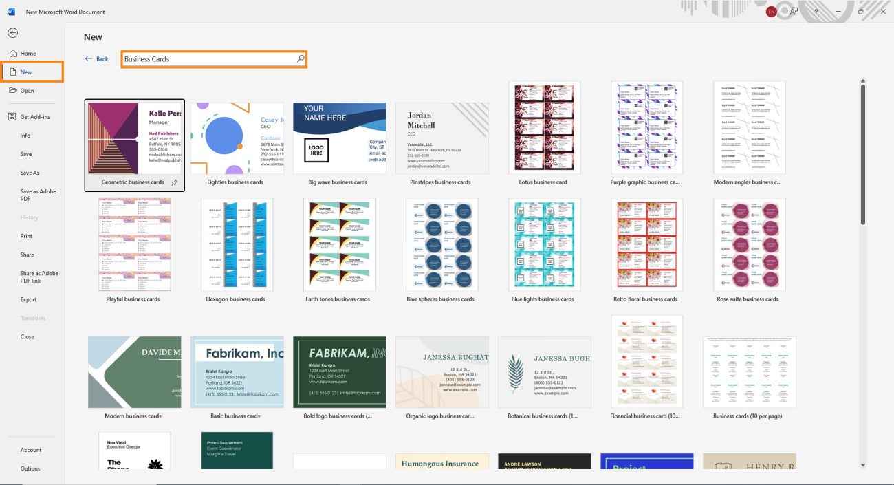
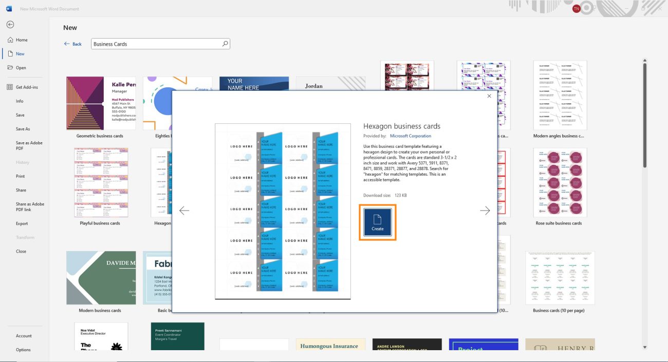
Scroll through the business card template options and click on a design that fits your needs. A window will pop up showing a preview and description of the template. If you like the design, click “Create.” For example, I’ve selected the Hexagon template.
Get yourOffice keyinstantly-affordable, quick, and easy to use!