Blog
Perfect Text Spacing: How to Adjust Kerning in Word

Kerning refers to the spacing between characters in a word, which affects the overall readability and appearance of your text. Adjusting kerning in Microsoft Word helps improve typographic precision, making your document look more polished and professional—especially for headlines, logos, or formal documents.
Microsoft Word allows you to fine-tune kerning settings for specific fonts and text sizes to achieve a balanced and visually appealing layout. This guide will walk you through step-by-step instructions on how to enable and adjust kerning, ensuring optimal character spacing for improved readability.
Why Adjust Kerning?
Fonts have default kerning settings, but not all fonts handle letter spacing equally. For instance, in the word “VASE,” the spacing between the letters V and A might look awkward in certain fonts, creating a distracting gap. Adjusting kerning can resolve these inconsistencies, resulting in cleaner, more professional text.


Automatic Kerning for Larger Fonts
- Select Text: If your document already contains text, press Ctrl+A (Windows) or Cmd+A (Mac) to select all text.
- Open the Font Dialog Box:
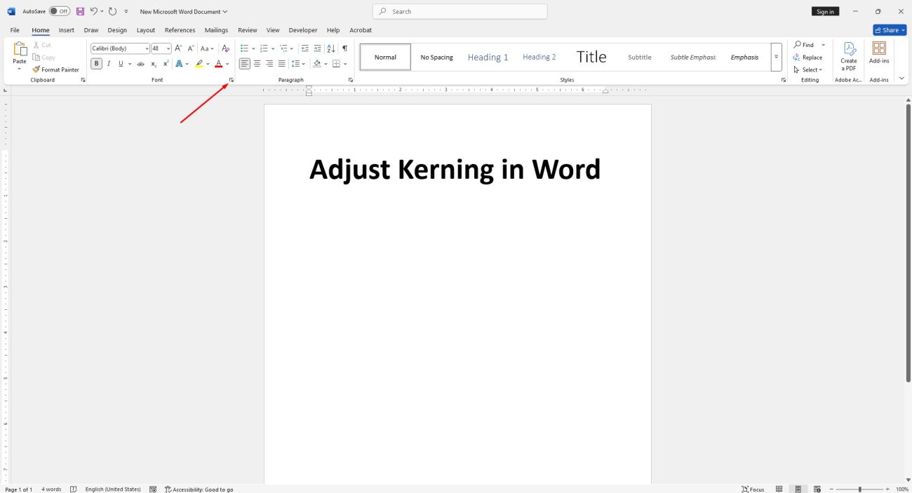
- Go to the Home tab and click the small expansion icon in the “Font” group, or
- Press Ctrl+D (Windows) or Cmd+D (Mac).
- Enable Kerning:
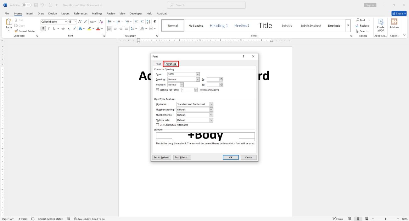
- In the Advanced tab, check the box labeled Kerning for Fonts.
- Enter the minimum font size for which kerning should apply in the adjacent box.
- Apply Changes: Click OK to enable automatic kerning for the selected text.
Manual Kerning for Specific Text
- Highlight the Text: Use your cursor to select the text you want to adjust.
- Open the Font Dialog Box:
- Go to the Home tab and click the expansion icon, or
- Press Ctrl+D (Windows) or Cmd+D (Mac).
- Adjust Spacing:
- In the Advanced tab, locate the Spacing section.
- Choose from the following options:
- Normal: Default spacing.
- Expanded: Increases spacing between characters.
- Condensed: Reduces spacing between characters.
- For precise control, use the By box to adjust the spacing incrementally by clicking the up or down arrows.
- Apply Changes: Once satisfied, click OK to save the adjustments.